Chikungunya Model
- Data Sources and Files
- PAHO Country Groups
- Model Description
- Model Accuracy and Sensitivity
- Model Applicability
- Some Interesting Observations
Data Sources and Files
We downloaded the following information from the Pan American Health Organization (PAHO) website.
- Weekly reports giving the total of number of cases observed since Week 1 (1/3/2014) of the chikungunya (CHIK) epidemic, for 50 of the 55 countries/municipalities in the Americas.
- CHIK incidence rate, defined on the weekly PAHO reports as "(autochthonous suspected + autochthonous confirmed)/100,000 pop."
- Total population (in thousands, from the CHIK PAHO report for Week 34, released on 8/22/14).
- Dengue (DEN) incidence rate, calculated from data available on the PAHO website as total number of cases divided by the population, averaged over the full time period available (1990-2013). Annual number of registered dengue cases were downloaded from the PAHO Regional Health Observatory (Health Indicators Time series).
- DEN PAHO report for 2014 (updated 01/19/15), used to update the previous DEN incidence rate information.
We also collected economic and demographic data, as well as information to measure proximity (geographic distance and connectedness) between countries.
- Economic data such as the Gini coefficient (a measure of wealth distribution) and Gross Domestic Product per capita were collected from the US CIA and the Socio-Economic Database for Latin America and the Caribbean (CEDLAS and The World Bank); both sites were required to cover the countries and to allow multiple economic measures.
- Demographic information including infant mortality and life expectancy (used as surrogates for the health of the nation and possible access to care and the percent of the population residing in urban areas) were downloaded from SEDLAC.
- Distances between countries/municipalities were calculated in ArcGIS, in order to estimate connectivity either by human travel between islands, or by the potential likelihood of vectors being transported by the winds from an infected country to a neighboring one.
- Number of ports and port calls between countries was derived from ArcGIS Online, a database of shapefiles available to ArcGIS users.
The above information, which is publicly accessible online (ArcGIS require the creation of a free account), is compiled in the data files below, available for download in Excel format.
- PAHO Data, giving the total number of cases (suspected + confirmed + imported) from Week 1 to Week 56, for PAHO countries.
- Economic data for PAHO countries.
- Ports and port calls between PAHO countries.
PAHO Country Groups
Because of its simplicity, the model is expected to work only if a number of conditions are satisfied. These conditions allow us to organize countries and territories that are members of PAHO into groups, based on the number of CHIK cases, the CHIK incidence rate, the dengue (DEN) incidence rate, and the nature of the model that best fits the historical data for each country. The table below explains how the groups are defined. The model is expected to apply to countries in groups III and IV.
|
CHIK incidence rate less than 1/100,000 |
Less than 20 CHIK cases |
|
|
GROUP 0 |
|
More than 20 CHIK cases |
DEN incidence rate less than 5/100,000 |
|
GROUP I |
|
|
CHIK incidence rate larger than 1/100,000 |
More than 20 CHIK cases |
DEN incidence rate less than 5/100,000 |
|
GROUP II |
|
DEN incidence rate larger than 5/100,000 |
1-parabola model |
GROUP III |
||
|
2-parabola model |
GROUP IV |
For more information on the model types, see the model description below.
As the CHIK epidemic spreads and the historical data evolves, countries can move between groups. For Week 56 of the CHIK epidemic, the groups are listed below. Countries in GROUP I have a number of autochtonous (locally acquired) cases much smaller than their respective numbers of imported case.
- GROUP 0: Belize, Bermuda, Bolivia, Bonaire, Chile, Ecuador, Falkland Islands, Paraguay, Saba, Sint Eustatius, Uruguay.
- GROUP I: Argentina, Canada, Cuba, United States of America.
- GROUP II: None
- GROUP III: Antigua & Barbuda, Aruba, Bahamas, Barbados, Brazil, Columbia, Costa Rica, Curacao, Dominican Republic, El Salvador, Grenada, Guadaloupe, Guatemala, Guyana, Haiti, Honduras, Mexico, Montserrat, Nicaragua, Panama, Peru, Puerto Rico, Saint Kitts & Nevis, Saint Lucia, Suriname, Turks & Caicos Islands, Venezuela, Virgin Islands (UK).
- GROUP IV: Anguilla, Cayman Islands, Dominica, French Guiana, Jamaica, Martinique, Saint Barthelemy, Saint Martin (French part), Saint Vincent & the Grenadines, Sint Maarten (Dutch part), Trinidad & Tobago, Virgin Islands (US).
Model Description
Because chikungunya is transmitted by mosquitoes (primarily Aedes aegypti in the Caribbean, and to some extent Ae. albopictus), and because mosquito abundance depends on local meteorological and geographic data (e.g. temperature, humidity, wind patterns, landscape, level of urbanization, population density, public health measures in place to limit vector abundance), modeling this disease at the microlocal level is a very complex process. Such an approach is necessary in order to understand and predict the efficacy of public health interventions or the effect of changes in local climate or in human behaviors. Here, we take a completely different viewpoint, suitable for the global description of the rapid spreading of epidemics in an environment where vectors are already present (dengue, which is transmitted by the same mosquitoes, is indeed prevalent in the area of study) and almost all individuals are susceptible (because chikungunya is new to this part of the world).
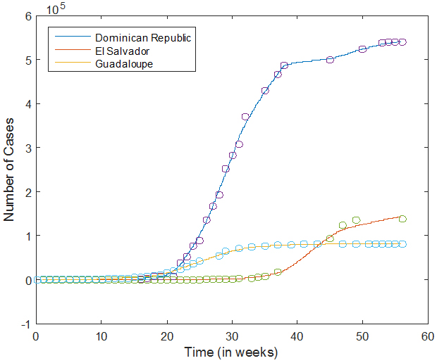 We use historical data to estimate the growth rate G of the epidemic in each country with more than 20 reported cases. The Excel file containing the PAHO weekly reports is read in MATLAB, and the corresponding data is first smoothed, and then interpolated on a finer grid (with a mesh size of 1/4 day). The figure on the right shows the data points (circles) and the interpolated data (solid curves) for three countries. As we can see, the interpolation captures the growth of the number of cases as a function of time, but fluctuations are evened out.
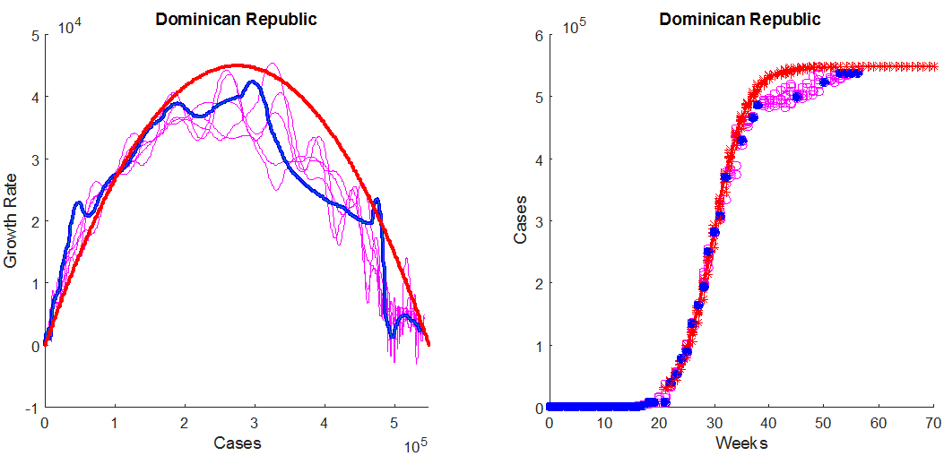
Next, the interpolated data is used to estimate the growth rate G of the epidemic, in number of cases per week, and to plot its value as a function of the total number of cases N. We proceed as follows. The value of G at time t is approximated from the smoothed data as a 2-point difference quotient. Specifically, we set G(t) = (N(t + dt) - N(t - dt))/(2 dt) except at the end points, where we use a one-sided quotient; for instance, G(0) = (N(dt) - N(0))/dt. Here, dt = 1/28 week is the mesh size for the smoothed data. For each value of t on the refined mesh, we therefore have an estimate of N(t) and of G(t), which allows us to graph G(t) as a function of N(t). An example of such a plot is shown in blue, in the left panel of the figure below. From now on, we are interested in describing the growth rate G as a function of the number of cases N.
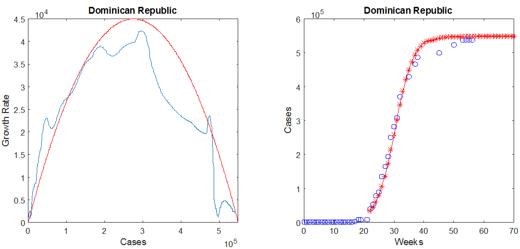
For most countries, the function G(N), whose graph is the blue curve in the above figure, may be approximated by an inverted parabola, shown in red, which intersects the horizontal axis in two locations: at the origin, and at the maximum number of cases N0. The equation for the parabola therefore depends on two parameters (the maximum value M and the value of N0), and is given by
(1) G2(N)=(4 M/N02) N (N0-N).
In the above figure, M ≈ 42009 cases/week and N0 ≈ 550000 cases. This information is sufficient to predict the number of cases as a function of time, which may be obtained by solving the differential equation dN/dt= G2(N), starting from an initial value taken from the smoothed and interpolated historical data. The result for the Dominican Republic is shown in the right panel of the above figure, in which the historical data points are the blue circles and the predicted values are the red crosses.
The values of the parameters M and N0 are estimated for each country by matching the parabola to the curve for the growth rate G, as well as the historical number of cases (blue circles in the right panel of the above figure) to the solution of the above differential equation (red crosses). For an epidemic in progress, the available data only provides information on the behavior of G(N) near the origin. It is nevertheless possible to make predictions by matching the inverted parabola to the available portion of the graph of G as a function of N. This matching process is easily done by hand, with the help of the MATLAB GUI we have developed.
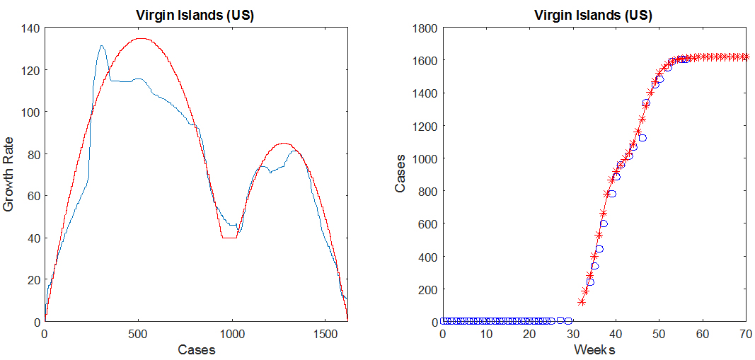
For countries in Group IV, we found that the data is better approximated by a two-parabola model, as shown in the figure below in the case of the US Virgin Islands. The presence of two "humps" in the plot of G as a function of N indicates that the epidemic spread in two phases, which could for instance occur if two separated geographic areas of the same country saw the first cases of the disease a few months apart or if the outbreak occurred over multiple vector seasons. The second parabola is defined by three parameters, its maximum M2, and the values of N where it crosses the horizontal axis, denoted by L2 (leftmost value) and R2 (rightmost value). In the figure below, M2 = 85 cases/week, L2 = 930 cases, and R2 = 1620 cases. The parameters for the first (leftmost) parabola are defined in the same fashion as in the one-parabola case, and for this example are given by M = 135 cases/week and N0 = 1030 cases.
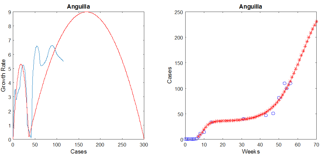
To illustrate model predictions at the beginning of an epidemic, the figure below shows two-parabola predictions for Anguilla, where as before, the blue indicates the observed data and the red is the prediction.
The model has a small number of parameters, the most important of which are the stable number of cases in each country and the peak value of the epidemic growth rate. By design, such a model is extremely robust in its behavior since it will always (as long as its parameters are non-negative) correspond to an exponential increase in the number of cases, eventually followed by nonlinear saturation toward a stable equilibrium. The parameters are estimated from the entire historical data available and therefore become more accurate as the epidemic progresses.
Model Accuracy and Sensitivity
The movie below shows a map of the error (predicted/observed chikungunya cases) for the 4-week predictions we made at the beginning of each month, for countries in Groups III and IV. Here, 100% indicates perfect prediction, while less than 100% indicates that the model predicted fewer cases than were observed and over 100% indicates the model predicted more cases than were observed. The Jenks Natural Breaks method was used to classify the symbols depicting the predicted as a percent of the total observed. The Oceans layer from the ArcGIS base layer database was used as background. The data file containing our one-month predictions is available for download in Excel format.
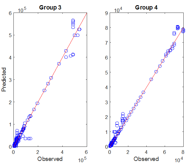 The graph on the right shows the predicted number of cases as a function of the observed number of cases for countries in GROUP III and IV, for weeks 36 through 56 of the CHIK epidemic. Predictions are one month forecasts based on the available historical data, made on
09/01/14, 10/01/14, 11/01/14, 12/01/14, 01/01/15, and 02/01/15. Each data point (circle) depicts the numbers of predicted (y-coordinate) and observed (x-coordinate) cases on
a given week, for a given country. The red lines have slope 1 and represent what would be a perfect match between predicted and observed data.
The graph on the right shows the predicted number of cases as a function of the observed number of cases for countries in GROUP III and IV, for weeks 36 through 56 of the CHIK epidemic. Predictions are one month forecasts based on the available historical data, made on
09/01/14, 10/01/14, 11/01/14, 12/01/14, 01/01/15, and 02/01/15. Each data point (circle) depicts the numbers of predicted (y-coordinate) and observed (x-coordinate) cases on
a given week, for a given country. The red lines have slope 1 and represent what would be a perfect match between predicted and observed data.
A full sensitivity analysis of our model is difficult to perform in the absence of automated parameter selection, since one would have to assess the effect of user decisions. As a substitute, we asked the following: how does noise in the data affect the shape of the growth rate G(N)?
To address this question, we estimated the amount of noise in the historical data by measuring, for each country, the difference between the smoothed version of the data and the actual data points. We then created noisy data sets by adding to the smoothed data a random number uniformly selected in an interval of the form [-1.5 δ, 1.5 δ], where δ is the estimated noise amplitude for the given week and country. The size of the noise therefore depends on the current stage of the epidemic; this is not too surprising since, as the number of cases gets close to its equilibrium value, the effect of noise is expected to be less than at the peak of the epidemic.
The figure below shows the graphs of G(N) for 5 noisy data sets created using the above method, in the case of the Dominican Republic. The corresponding curves are shown in magenta in the left panel. The thick blue curve is the graph of G(N) calculated from the original (historical) data set, and the parameters for the inverted parabola are also estimated from the historical data. The right panel shows the noisy data points (open magenta circles), the historical data (filled blue circles), and the predictions (red crosses). Note that the actual data appears in fact less noisy than the artificial data sets, leading to less oscillations in the graph of G(N). This is because the fluctuations in the actual data are likely to be correlated, whereas the noise we add to the interpolated data is not. Regardless, the conclusion of this experiment is that noise in the data increases the fluctuations of G(N), but that the parabola, and therefore the model parameters, are rather insensitive to such fluctuations, since they are associated with the global features of G(N): the width of the parabola, N0, determines the final number of cases and the maximum M of the parabola determines the peak growth rate of the epidemic.
Model Applicability
That the general trend of an epidemic may be reproduced by fitting one or two parabolas to the growth rate data may at first seem quite surprising. But making such an approximation for G is very natural, since the one-parabola model represents the simplest nonlinear form that the function G(N) can take, assuming the existence of a single non-zero equilibrium value (N0) for the number of cases N. As a consequence of this approximation, once the epidemic starts, N rapidly increases towards and eventually stabilizes at N0. This is the expected behavior of an epidemic spreading among a large number of susceptible individuals. The two-parabola model is an extension to a situation in which the spreading of the disease occurs in two different stages; as mentioned above, an example would be an epidemic that grows and saturates in one part of a country (as modeled by the first parabola) and then moves to the rest of the country (this second phase being described by the second parabola).
The methodology discussed here should in principle be extendable to situations where a vector-borne disease, or for that matter almost any communicable disease, rapidly spreads in a large and well connected group of susceptible individuals. But it is unlikely to work well in a population that is geographically dispersed or has a large number of immune individuals, when, for vector-borne diseases, a small number of vectors are present (so that the transmission rate significantly depends on mosquito abundance), or for diseases that spread relatively slowly compared to seasonal variations or to the speed at which public health interventions are put into effect. In particular, we assumed that the vectors were in sufficient abundance so that fluctuations in their numbers, due for instance to temperature and precipitation variations, could be neglected. Similarly, we did not attempt to model how easy or difficult it is for the chikungunya virus to be transmitted from one individual to another via the mosquito population. In other words, the global (or macroscopic) approach we adopted here relies on the following hypotheses.
- The epidemic spreads relatively quickly, in a densely populated or well-connected area. As a consequence, the total population (susceptible plus infected) can be assumed to be constant.
- The disease is new to the area or immunity is transient but persists over a period of time longer than the duration of a given epidemic, so that there is a large number of susceptible individuals.
- For a vector-borne disease, the vector is present and abundant in levels that support disease transmission, so that there is no need to model the dynamic of the mosquito population.
- The goal is to model the number of new cases, incidence, as a function of time, not the recovery process. In other words, we are only concerned with susceptible and infected individuals, and once an individual is infected, he/she remains a case.
If these conditions are satisfied, we expect the model to have predictive value, regardless of the type of infectious disease that is being considered. Indeed, if we denote by N the number of cases and by N0 the total population at risk, the rate of change in the number of infected individuals (dN/dt) is expected to be proportional to the product of two terms:
- the likelihood (N/N0) that when a mosquito bites an individual, this person happens to be infected, and
- the number of susceptible individuals, N0 - N.
(2) dN/dt=G(N)=C N/N0 (N0-N).
The expression in Eq. (2) above matches the inverted parabola model discussed previously (see the expression for G2(N) given in Eq. (1)), with C = 4 M/N0, where M is the maximum of the parabola. In fact, Eq. (2) is nothing but the equation for the rate of change of the number I of infected individuals in a standard epidemiologic model, the SIR model, where infected individuals do not recover, so that the number of susceptible individuals is equal to N0 - I. For this reason, the applicability of the model, assuming the hypotheses listed above are satisfied, is quite general.
In terms of the classification defined above, we expect the model to work for countries in groups 3 and 4, for which both the CHIK and DEN incidence rates are high.
Some Interesting Observations
 Going back to Eq. (1),
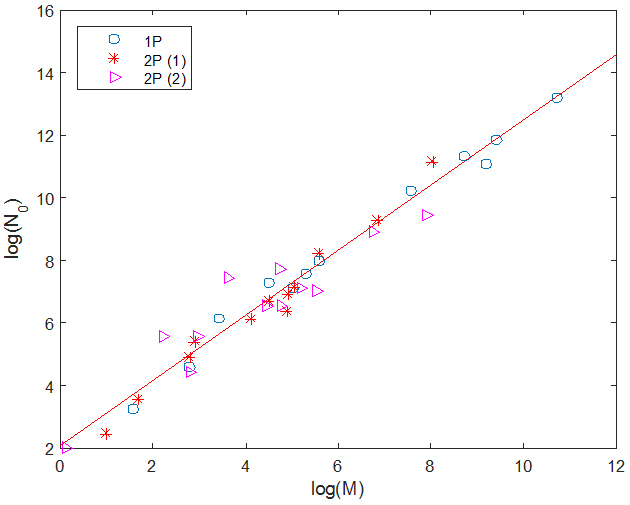
G2(N)=(4 M/N02) N(0 - N), we see that the slope of the parabola at the origin is given by G'2(0) = C = 4 M/N0, and is therefore proportional to the ratio of the two parameters of the one-parabola model. The figure on the right shows a plot (circles) of log(N0) against log(M) for countries for which we believe there is enough data to have reasonable estimates for M and N0. We have also plotted on the same figure the corresponding values for two-parabola countries: the red crosses show the parameters of the first parabola, and the magenta triangles those of the second parabola, with M defined as M2 and N0 as (R2 - L2). The red line is a linear fit of the data and has slope 1.04 and y-intercept 2.07. This suggests that all parabolas have a slope at the origin of similar magnitude, which we calculate to be, on average, equal to 0.469 weeks-1.
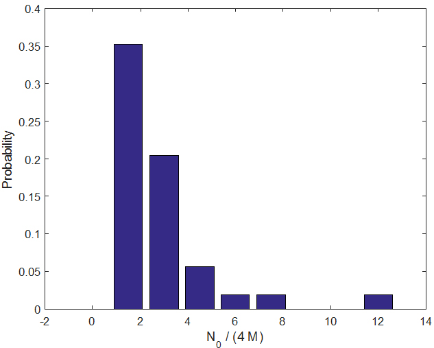 Since the slope at the origin C has the dimension of an inverse time, its inverse defines a characteristic time, which on average (for all parabolas in one- and two-parabola models for which we have sufficient data) is given by <1/C> ≈ 2.85 weeks.
The number τ = 1/C represents the time it takes for the first infected individual to transmit the disease (through the mosquito population) to another individual, a value similar to the extrinsic incubation period (time for the vector to become infectious) but presumably with additional time accounting for lags in host seeking and the intrinsic incubation period (time for the individual to become infectious). This quantity is also expected to be proportional to local mosquito abundance. The above figure shows a bar-graph estimate of the probability distribution function for τ = 1/C.
Since the slope at the origin C has the dimension of an inverse time, its inverse defines a characteristic time, which on average (for all parabolas in one- and two-parabola models for which we have sufficient data) is given by <1/C> ≈ 2.85 weeks.
The number τ = 1/C represents the time it takes for the first infected individual to transmit the disease (through the mosquito population) to another individual, a value similar to the extrinsic incubation period (time for the vector to become infectious) but presumably with additional time accounting for lags in host seeking and the intrinsic incubation period (time for the individual to become infectious). This quantity is also expected to be proportional to local mosquito abundance. The above figure shows a bar-graph estimate of the probability distribution function for τ = 1/C.
Further attempts to refine the model included trying to describe the groups in terms of economic (e.g., Gini Coefficient, per capita GDP), demographic (population density and percent of population living in urban areas), connectivity (number of ports, number of port calls, and distance between islands), and health indices (infant mortality and life expectancy). Such attempts were not fruitful, that is, we were unable to characterize the groups using these variables. We believed that these variables might allow us to predict to which countries the disease was more likely to spread. However, while, for the most part, countries closer to the origin (Saint Martin) were the first to also see infection (observed in our data as well as by Cauchemez et al), other information was not helpful in identifying factors which made a country more or less susceptible. The unfortunate conclusion is that, at the given data resolution, we are left predicting the extent of an established outbreak rather than being able to predict where the next outbreak might start.