
GEOGRAPHY 416A COMPUTER CARTOGRAPHY FALL 2009
MODULE 7
Introduction
In this module, we will go over the principles of color {multicolor}. We will
cover some basics about what color is, the dimensions of color, and some color
specification systems. Color has many functions in mapmaking. Color affects the
structure of the map. Color does this by simplifying and clarifying information
on the map, in other words some colors stand for certain things. Color also
unites various map elements.
Color affects the readability of the map. Color can increase the visual and perceptual legibility of the map. Color can do this by adding sharp contrasts through the use of complementary colors. Color can affect the readerÕs psychological reaction to the map. The use of certain colors can lead map-readers to false conclusions. For example, using a primarily red color in your map can elicit anger in your map-reader.
The Nature of Color
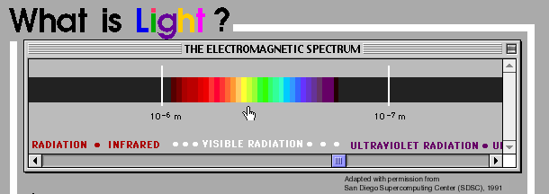
Color is a perceptual phenomenon. Color is caused by receptors in our eyes that are stimulated by electromagnetic radiation of certain wavelengths. The production of color requires 3 elements: light source, object, and the eye-brain system of viewer. There are some physical dimensions to color, Spectral and Reflected Color. Spectral color refers to color that is emitted as light, we respond to spectral colors of the visible spectrum. Reflected color results from selective absorption of visible radiation.
Spectral Color (Color as Light)
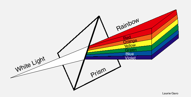
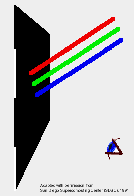
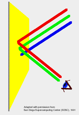
Energy emitted from the sun comes in the form of the electromagnetic spectrum; colors come from a small portion of those wavelengths that are spectral hues of light. A hue is a specific color (red, green, blue, etc.). When all the hues are combined together you create 'white light'.
Spectral colors are transluscent - we can see through and overlap colors to form other colors. The way we see colors of light is dependent on which colors are being absorbed:
blue skies when sun angle high - longer wavelengths absorbed, shorter wavelengths remain;
oranges & reds when sun angle low (morning/evening) - shorter wavelengths absorbed, longer wavelengths remain;
white clouds are 100% mix of all spectral hues;
gray clouds are <100% mix of hues;
black night sky - 100% of all spectral hues absorbed due to absence of light;
Reflected Color (Color as Pigment)
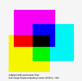
Pigments are opaque (not transparent) paints or inks placed on opaque surfaces, such as the printing on a page. Most of the colored objects we see are made up of combinations of reflected wavelengths. Surfaces and objects are illuminated by white light, which absorb differing proportions of visible wavelengths and reflect the remainder.
Black reflectance - absorption of all colors
White reflectance - reflectance of all colors
Gray reflectance - 50% absorption of colors, 50% reflection of all colors
Cyan reflectance - reflectance of blue and green, 100% absorption of red
100% reflectance blue and red, 100% absorption green
100% reflectance red and green, 100% absorption blue
Subtractive colors are so named because, when illuminated with white light the surfaces are seen as yellow, magenta, or cyan, These colors result because a surface will reflect 2 of the 3 additive primaries, and subtract (absorb) the 3rd. A subtractive primary color and the additive primary color it absorbs, are called complementary colors:
cyan is the complement of red;
magenta is the complement of green;
yellow is the complement of blue.
Color Dimensions
Color perceptions also has a psychological side. By varying hue, value, and chroma you can alter how people react. Hue refers to various colors. Value refers to the lightness and darkness of a hue. Changing chroma affects the intensity of a color.
Hue
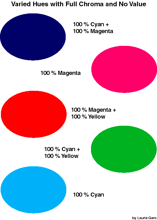
Hue is the term given to the various colors we perceive. Combining various percentages of the primary hues and altering their value and chroma create millions of hues. The primary hues are cyan, yellow, and magenta, which can all be combined together in various percentages to achieve different colors.
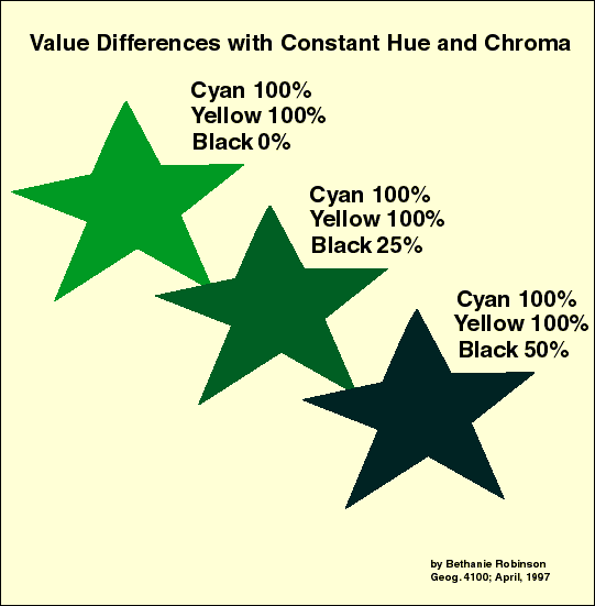
Value
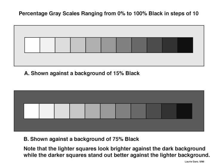
Value refers to the lightness or darkness of a hue. The value is higher when there is more lightness; the value is lower when hue appears darker. A gray scale a good example of value, by changing the amount of black, you can create a scale of lighter to darker colors for use on a map. Keep in mind that the human eye cannot easily distinguish more than 5-7 gray tones. The value of a hue is controlled by: adding white to increase value (lighten hue) or adding black to decrease value (darken hue).
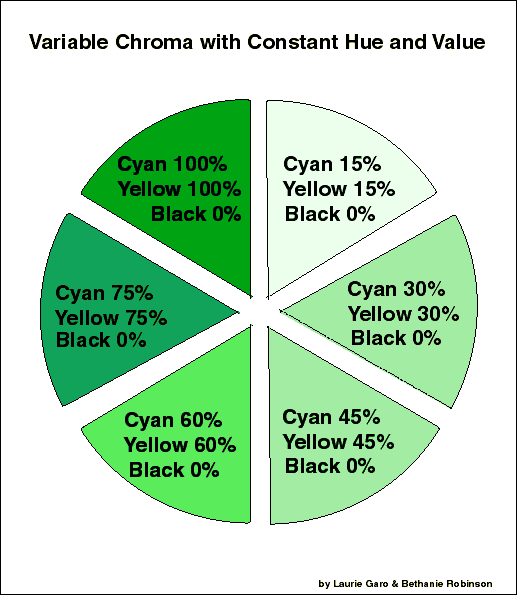
Chroma
Chroma is also known as the intensity or saturation of a color. Chroma refers to comparison of a color to neutral gray whereby neutral gray is achromatic and full color is fully saturated (pure and brilliant). Chroma ranges from 0% (neutral gray) to100% (maximum saturation - no gray).
Color Interactions
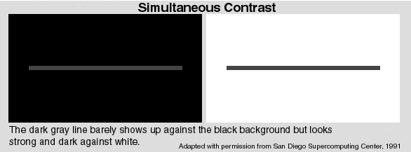
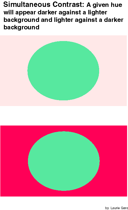
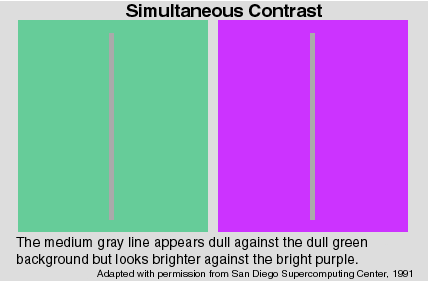
Simultaneous contrast
Simultaneous contrast occurs when the eye spontaneously produces the complementary color of a viewed color. When a color is surrounded by another color, it begins to appear tinged by the complementary color of surrounding color. Simultaneous contrast adjacent colors will appear lighter when surrounded by a darker color and darker when surrounded by a lighter color.
Successive Contrast
Successive contrast occurs when a given color is viewed in one environment (one color background) and then another (a different color background) in quick succession. Successive contrast can cause problems regarding interpretation of color on a map or in matching a color to its appropriate legend color. This is because the hue appears different with different backgrounds; the eye may be confused if it cannot find the same hue.
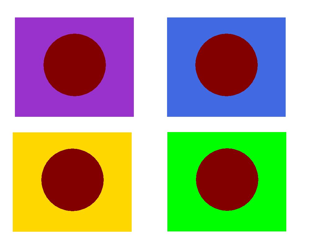
Red-brown circles appear strongest against yellow-orange and bright green backgrounds, dullest against purple and blue
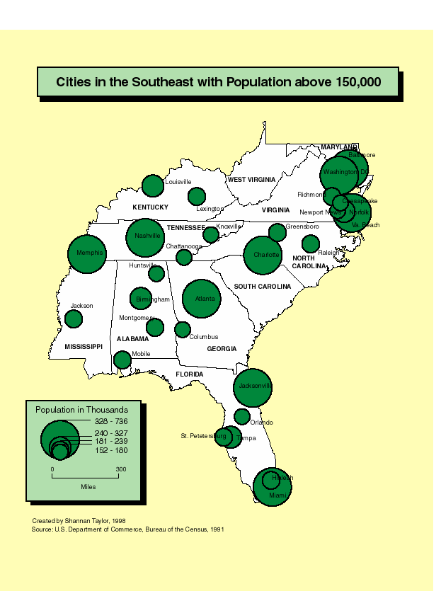
Contrast and Figure-ground
Color contrasts can create figure-ground on a map. To do this, use warm colors (reds, oranges, yellows) for figure hues and cool colors (blue, green, gray) for ground hues. This way the object of your map will stand out against the base map. Complementary colors also add to good figure-ground relationships. Chroma can also help with figure ground relationships, high chroma (bright) is better for figure and low chroma (dark) is better for ground.

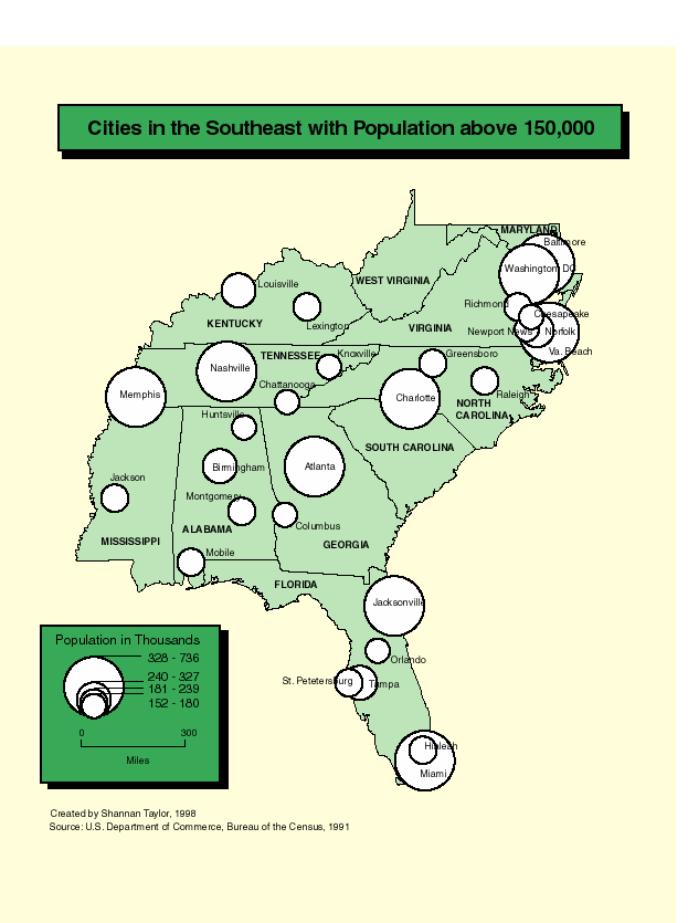
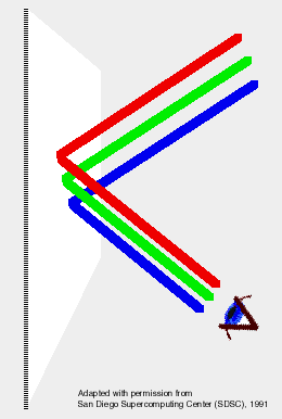
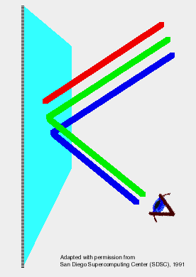
Examples of Good Figure/Ground
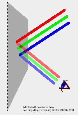
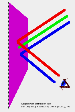
Examples of Poor Figure/Ground
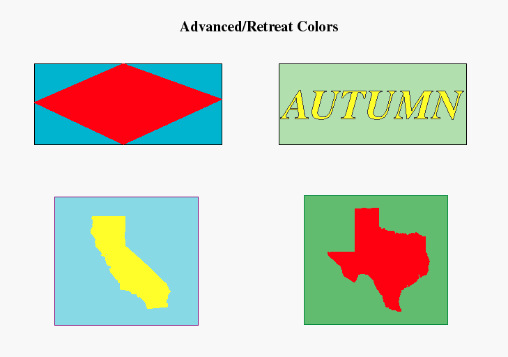
Advance/Retreat Colors
Humans perceive certain colors as advancing, others as retreating. Longer wavelength colors (reds) appear closer to viewer when seen next to colors of shorter wavelengths (blues).
Hue - longer wavelengths advance, shorter wavelengths retreat.
Value - high value (lighter) advances, low value (darker) retreats.
Chroma - deep, highly saturated colors advance, less saturated colors retreat.
Qualitative Color Conventions
Certain color associations are commonly used in mapping. The best examples of color associations are those used in topographic mapping. The high use of topographic maps have helped to standardize many color associations:
blue = water, water-related symbols (swamps);
green = vegetation;
brown = contours (hills).
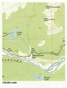
Hypsometric tints for elevation are somewhat associative as well:
white/light blue = glaciers;
reds/browns = high elevations w/ little vegetation;
green = vegetated elevations;
yellow = drier elevations;
blues = marshes & swamps.
Quantitative Color Conventions
Color can be used to impart quantitative (numerical) information very effectively. There are several different ways to use color in mapping quantitative information. Typically, darker colors mean higher numbers, and lighter colors mean lower numbers. Remember to design your legend effectively to show the color progression of values.
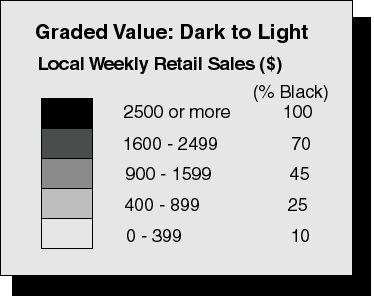
Gray and simple-hue series
One hue is selected and increasing the percentage of ink used to create the hue varies its chroma. Again, remember the darkest shade means highest value, the lightest shade means the lowest values. Due to limits of the human eye and the printing process you should try not to use more than 6 classes.
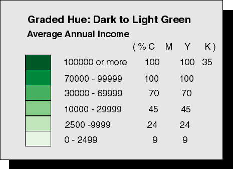
Hue Progression (Part Spectral plan)
A partial spectral hue progression is a graded series of 2 or more hues where the chroma/value ranges from light to dark. The main benefit of this hue progression is that it enables a clearer differentiation between classes. This is a good system for maps with more than 5 classes. The most effective use of this system is to combine 2 or more hues that are complementary on the color wheel and go well together visually:yellow to green; yellow to blue; blue to purple; or yellow to orange to red to brown.
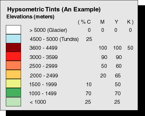
Full-Spectral Progression
A full spectral progression color progression uses a separate hue to represent different amounts of data. Red usually represents higher amounts and then cycles through the color wheel until you reach dark colors. This system is most commonly used for hypsometric layer tints that show elevation.
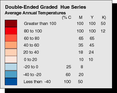
Double-ended Hue Progression
Double-ended hue progression is used for representing 2 opposing characteristics of a data set on one map. For example, showing the temperature above and below zero, or positive and negative population change. The key to this hue progression is to use 2 distinctly contrasting yet visually pleasing hues. It is important that each hue has same number of classes; highest and lowest classes should stand out distinctly.
If you have corrections, comments, or questions about this web site, send Email to the Web Architect
Copyright © 2008 Keiron Bailey